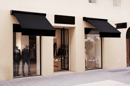

No matter your industry, your business’ storefront is vital to your success. Business owners all know that first impressions are key, and the facade of your building is a marketing strategy of its own. If your retail or restaurant location is in a densely packed area, having an impressive storefront can make a large difference. There are many ways to update your storefront’s design that can improve its allure to passers-by.
1. Make Your Name Visible
For both digital and physical business; logo design, brand name, and brand placement are the factors that introduce new customers to your store. Once you have your store’s brand and logo figure out, plan how you will incorporate into your signage. Avoid the standard signage choices of just placing your name on the door. There are a few ways to avoid the traditional signage and stand out. Depending on zoning laws, you can invest in awnings and signage that hangs perpendicular to the sidewalk. A good rule of the thumb is to look down your street and see which stores catch your eye and which designs are being overused around you.
2. Less is More
Throughout the history of marketplace marketing the practice of “just yell louder” has dominated most trends. In densely populated cities, many storefronts go overboard and scare off prospective customers by having a cluttered, overwhelming storefront design. Remember, you are trying to compete with the stores around you. A good design method is to keep things simplistic. Negative space combined with clear signage in a cluttered street filled with overbearing visuals can be very attractive to consumers. Keep copy short and logos prominent.
3. Invest in Signage That Changes
Chalkboard specials are becoming more popular. Owning signage that can be altered easily can communicate unique messages and sales. However, instead of just sticking to a simple A-frame chalkboard sign, you should consider how interchangeable signs can be unique. Some businesses have signs hung on their windows or even draw on the sidewalk to attract customers looking down at their phones.
4. Be Expressive
One mistake many storefront designers make is following templates too closely. Drawing inspiration from other storefronts can be effective (we recommend picking stores nowhere near your location if you use this method). However, your storefront display should match your interior design and the feel of your store. There should be a design through-line for a consumer from the moment they see your sign to getting their receipt. More and more, being unique matters.
5. Windows Bring People Halfway Into Your Store
Many business owners do not think about their windows enough. Window size, placement, and even custom designs can completely change a storefront’s design. Great window design capitalizes on “negative space” because windows are not perceived as cluttered. Windows can also display your brand name & logo with a perforated film to provide more privacy to your customers without sacrificing giving a view into your store. Storefront windows also allow prospective customers to experience your store from the outside. Some restaurants design windows directly to the kitchen instead of the dining room to offer a unique look at the store. Likewise, retail stores tell stories with mannequin displays in the window that invite customers inside.
When it comes to owning a retail property, storefront design is the most important factor in getting newcomers in your door next to the location. A big part of your storefront design is how you design your windows. At Merrimack Valley Glass & Mirrors we can help design and install windows that accentuate your location’s best features. Contact us to learn more about how we can help.
